Symplifi
Designed a smartwatch-first symptom tracking experience to help people with POTS log symptoms easily and understand patterns during low-energy moments.
Role
Shadow Product
Design Lead
Team
1 Product Design Lead
1 Shadow Product
Design Lead
4 Product Designers
Timeline
Jan 2024–Mar 2024
(10 weeks)
Deliverables
Smartwatch Prototype
Mobile Prototype
Branding & Design System
Context
Symplifi is a symptom-tracking product designed for people living with Postural Orthostatic Tachycardia Syndrome (POTS), a chronic condition characterized by unpredictable and fluctuating symptoms. Because there is no formal cure, symptom tracking is one of the primary ways patients identify patterns, understand triggers, and communicate with healthcare providers.
However, symptom tracking often happens during low-energy moments such as fatigue or brain fog, when long forms, dense data, or rigid workflows are difficult to use. Our goal was to design a system that makes symptom tracking feel manageable rather than overwhelming, across smartwatch and mobile platforms.
My Role
As the Shadow Product Design Lead, I supported the Product Design Lead by participating in client meetings, facilitating design discussions, and creating research and usability testing materials. I also contributed hands-on across ideation, UI exploration, branding, and prototyping, helping shape both the smartwatch and mobile experiences.
Problem
People living with POTS often experience sudden symptom flare-ups, making it difficult to log data or understand patterns, especially when existing tools require long, high-effort interactions.
Current symptom-tracking tools often:
Require high effort during low-energy moments
Present dense or overly clinical data
Make it difficult to compare symptoms over time
Focus on recording data without helping users interpret it
Together, this led to a single core issue:
Core Issue
Users lacked a simple, low-effort way to log symptoms and meaningfully understand their health data across devices.
Research
Due to recruitment and time limitations, we were unable to interview individuals living with POTS directly. To mitigate this, we relied on:
Existing research conducted by the product founder
Secondary research on POTS and chronic illness management
Competitive analysis of symptom-tracking tools
Our research focused on understanding:
When symptom tracking typically occurs
What makes logging feel manageable versus exhausting
How smartwatch and mobile experiences could complement one another
From research, several insights were identified:
Logging must be quick and low-effort
Fatigue and brain fog make long interactions impractical.
Familiar patterns reduce friction
Users felt more confident when designs followed native Apple Watch behaviors.
Data needs context to be useful
Logs alone are not helpful without comparison or interpretation.
Visual tone affects motivation
Overly clinical interfaces felt discouraging and emotionally heavy.
Ideation
We began ideation with sketches and low- to mid-fidelity wireframes across smartwatch and mobile, focusing on how symptom tracking could feel lighter, faster, and less cognitively demanding.
Rather than designing every possible screen upfront, we focused on:
Core smartwatch logging interactions
How mobile could support reflection and pattern-finding
Establishing a calm, approachable visual language
Smartwatch Lo-fi Wireframes
Biometrics
Water Intake
Mood Picker
Urination
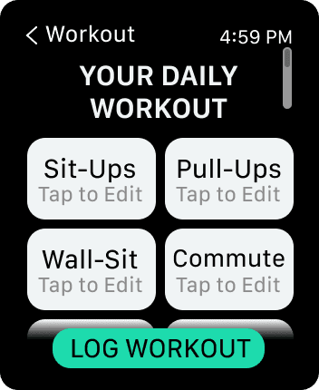
Daily Workout
Pre-logged
Smartwatch Mid-fi Wireframes
Biometrics
Water Intake
Mood Picker
Urination
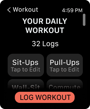
Daily Workout
Pre-logged
Mobile Lo-fi Wireframes
Home
Calendar
Data
Mobile Mid-fi Wireframes
Home
Calendar
Data
User Testing
We conducted task-based usability testing with 17 participants familiar with smartwatches or managing health data. Participants interacted with both the smartwatch and mobile prototypes while we observed navigation behavior, hesitation, and confidence, followed by structured questions on usability, task clarity, visual design, and overall experience.
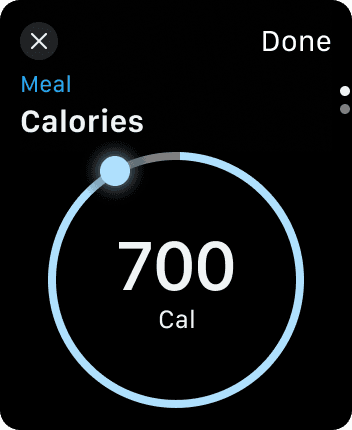
Smartwatch tasks included: logging symptoms such as muscle pain, water intake, meals, workouts, mood, medications, and urination.
Mobile tasks focused on: interpreting health information, reviewing past logs, and creating comparison graphs to identify patterns.
Insights from usability testing directly informed interaction patterns, visual hierarchy, and error prevention in the final high-fidelity designs.
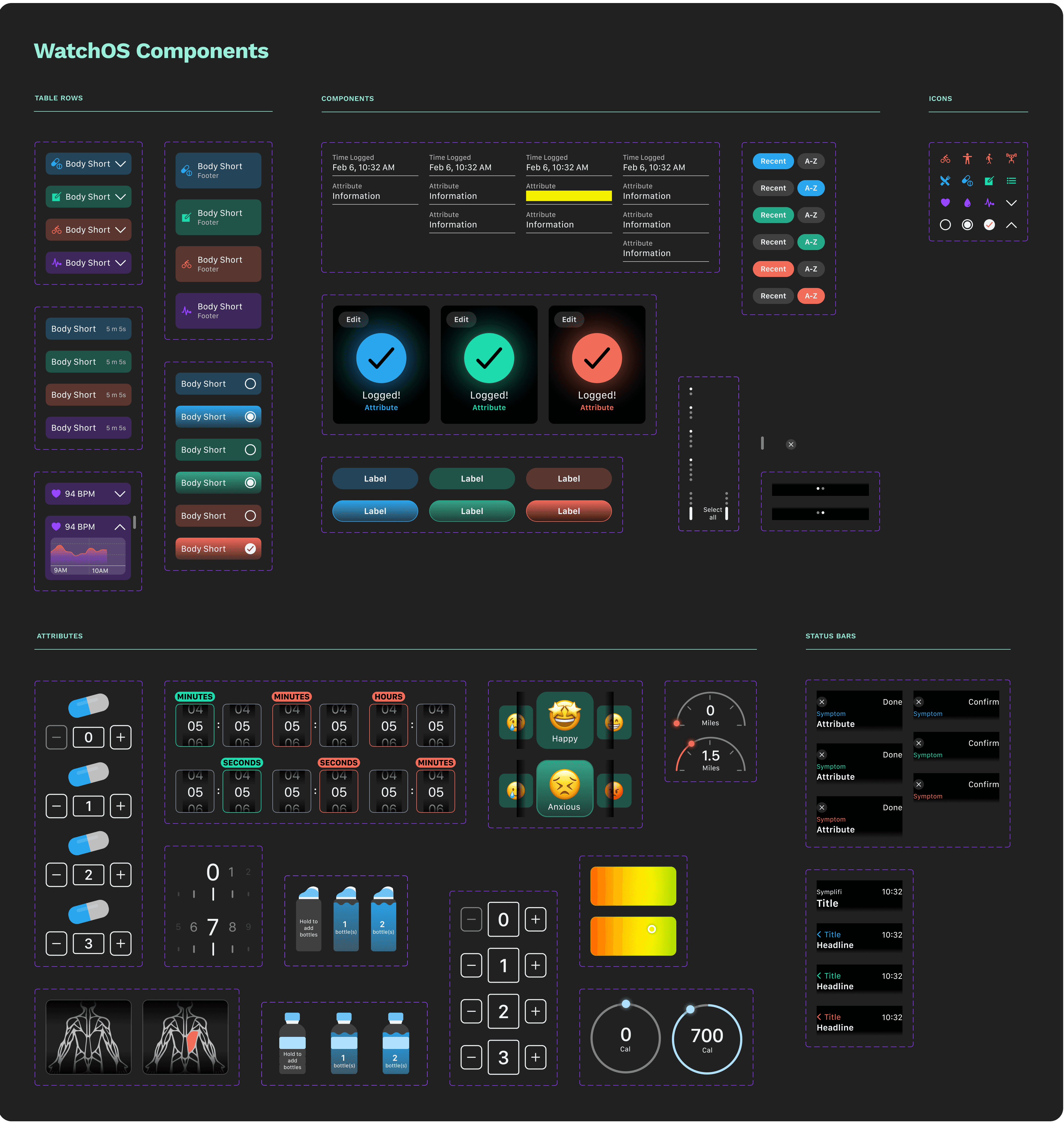
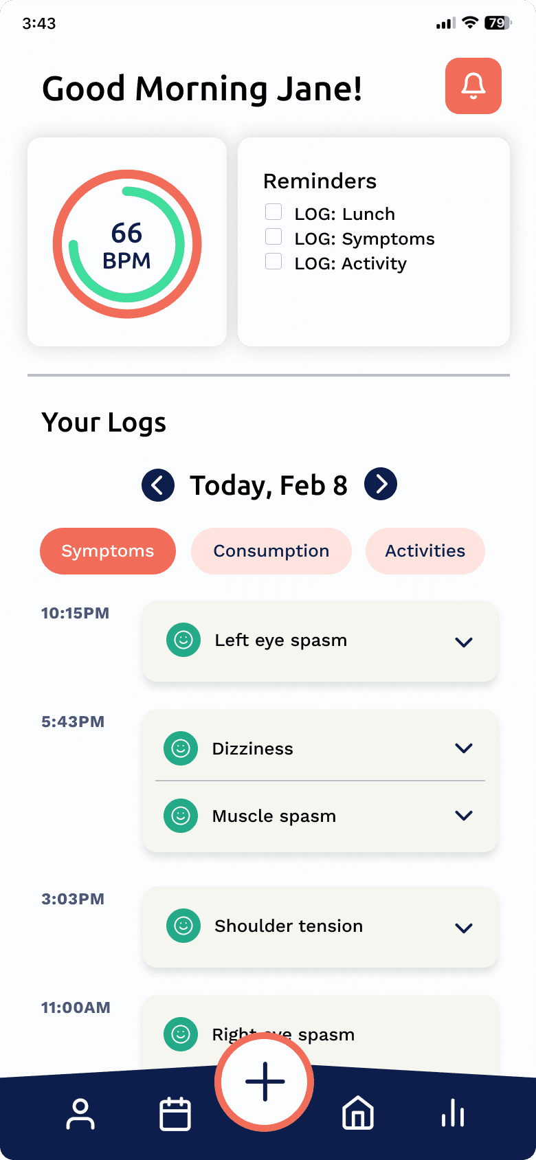
Final Designs
Smartwatch — Supporting quick, low-energy logging
Most existing smartwatch solutions rely on text-heavy flows that are difficult to complete during symptom flare-ups. The smartwatch experience was designed to minimize effort and reduce mistakes.
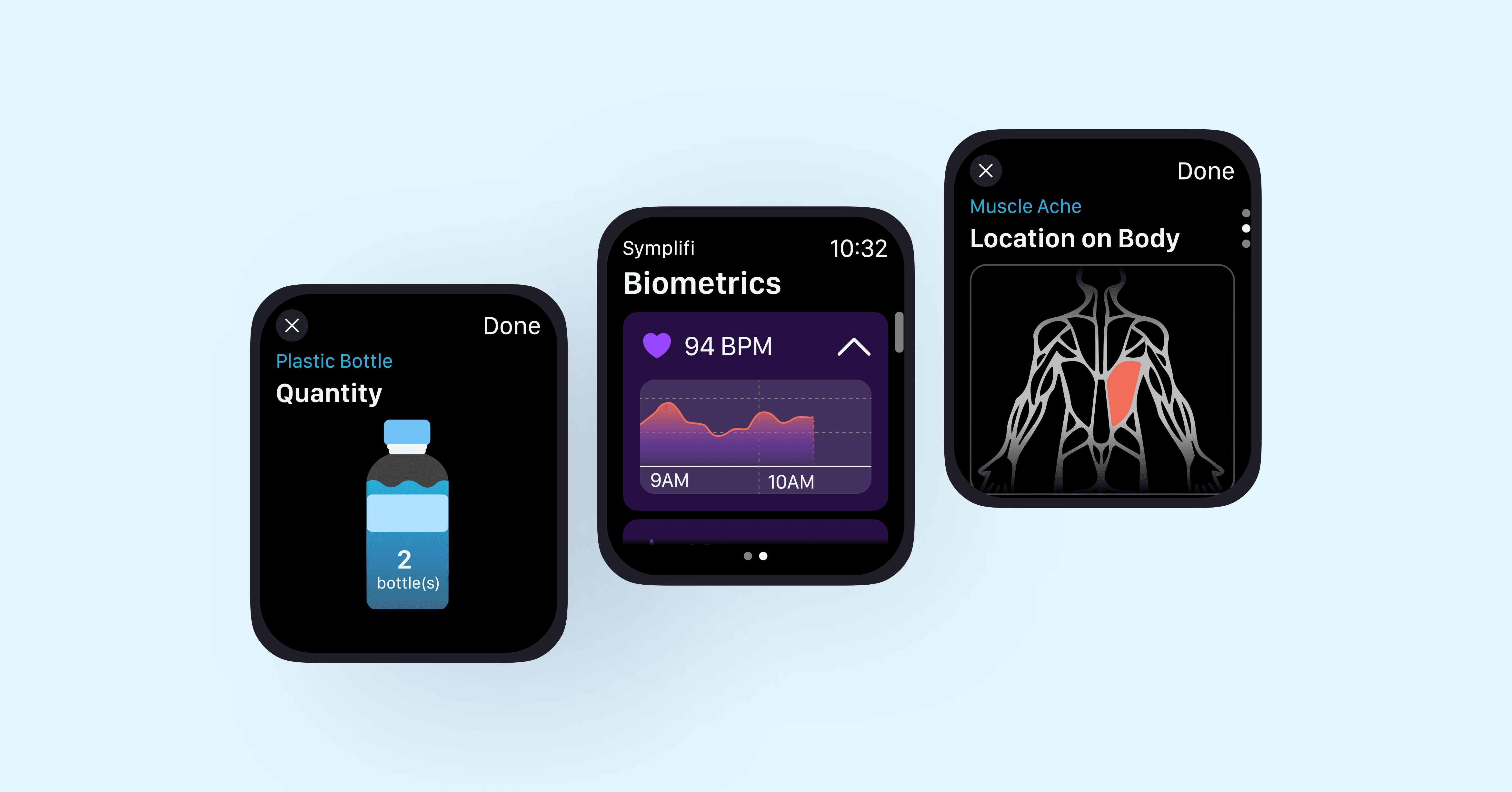
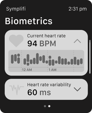
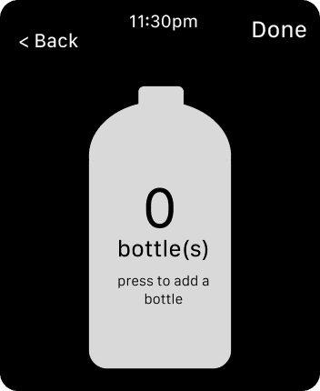
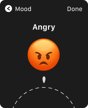
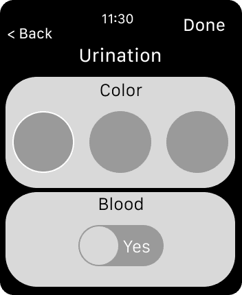
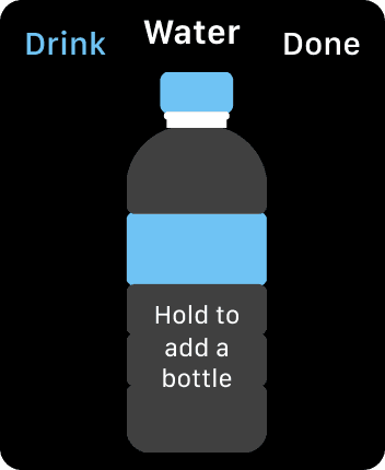
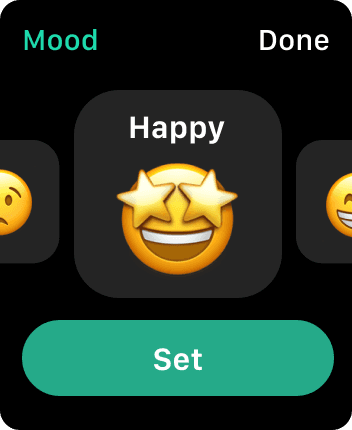
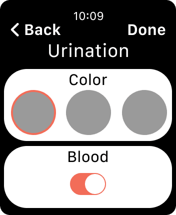
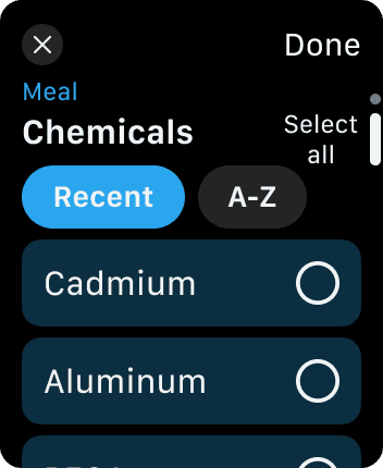
Decision #1: Make logging visual and tap-based
Visual, tap-based inputs replaced text fields, such as pressing a water bottle icon instead of typing quantities or selecting areas on a body map instead of naming symptoms. Testing showed these inputs significantly reduced effort and hesitation.
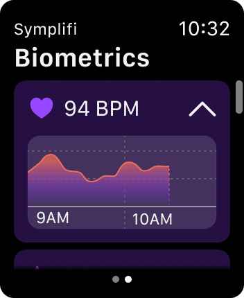
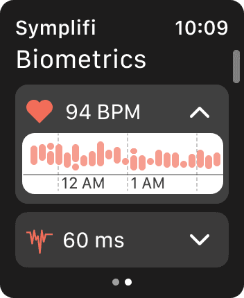
Biometrics
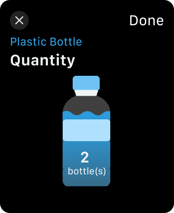
Water Intake
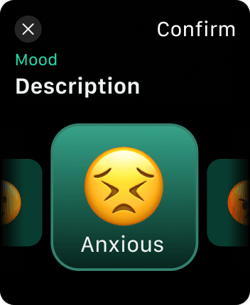
Mood Picker
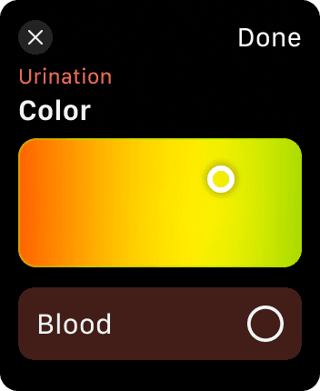
Urination
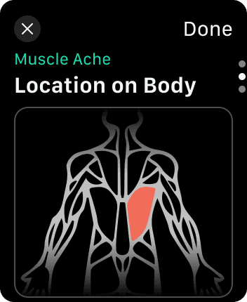
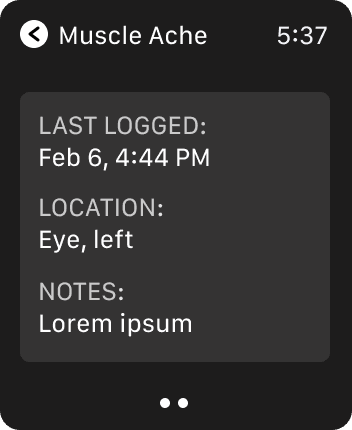
Muscle Ache
Decision #2: Lean into native Apple Watch interactions
Digital crown scrolling and swipe gestures matched platform conventions. Usability testing participants described these interactions as intuitive and easy to learn.
Swipe up/down or use digital crown to scroll through pages
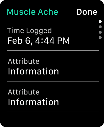
Decision #3: Prevent mistakes with recap screens
Testing showed that users wanted reassurance before submitting logs, particularly when fatigued. As a result, the former pre-logged attributes screen was redesigned into a recap screen, allowing users to quickly review and confirm their entries before submission.
Done button allows user to review log at any point
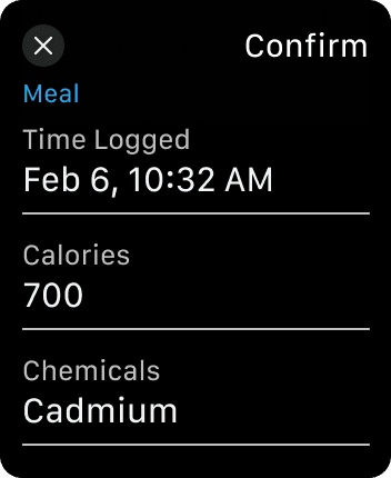
Review and confirm logs to prevent mistakes before submission.
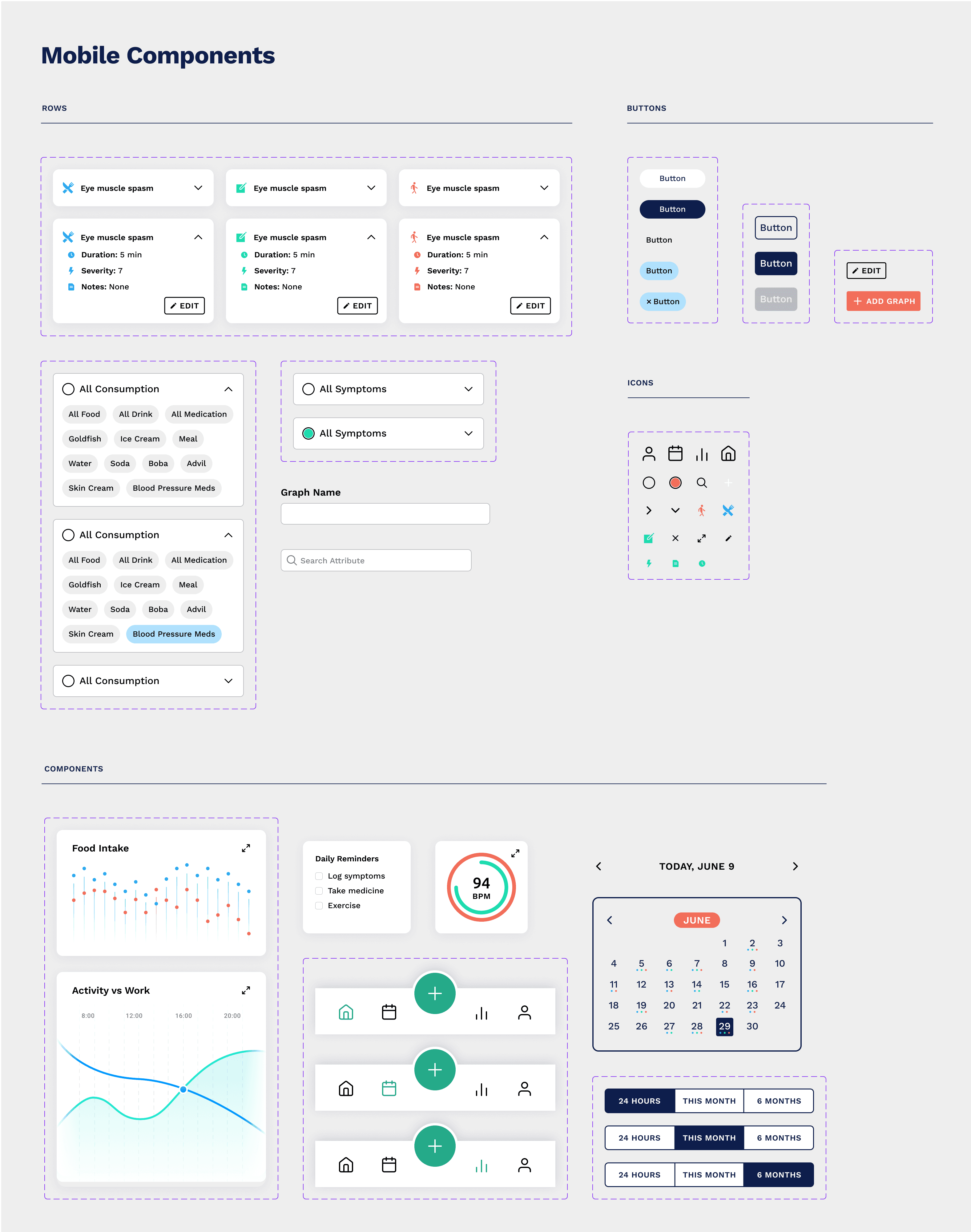
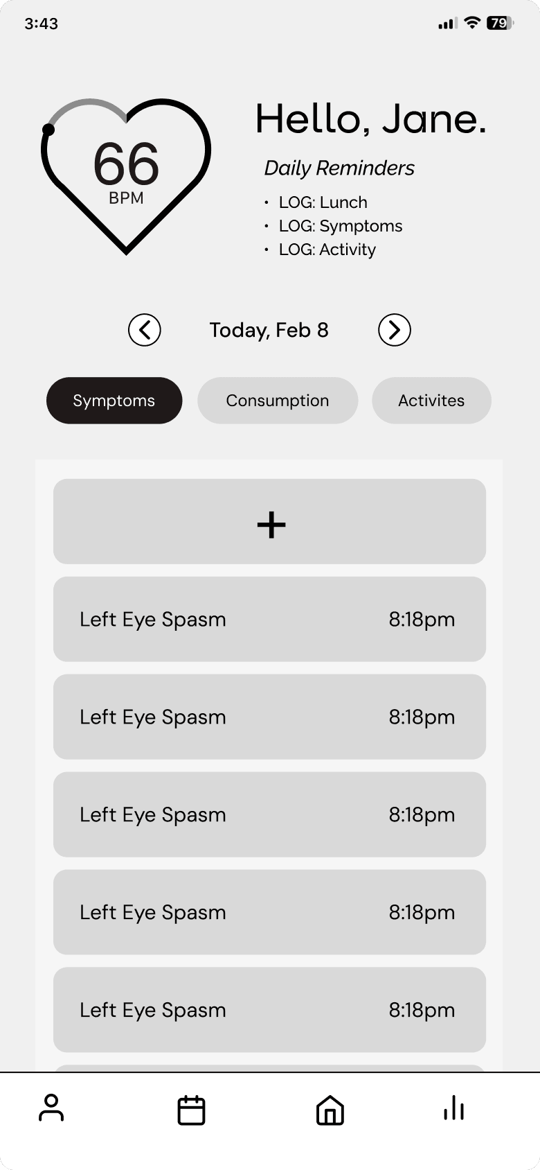
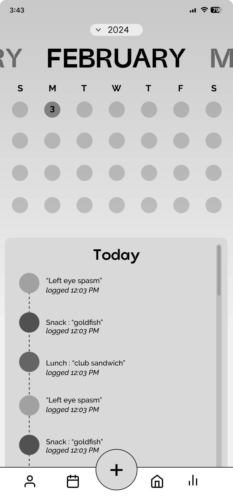
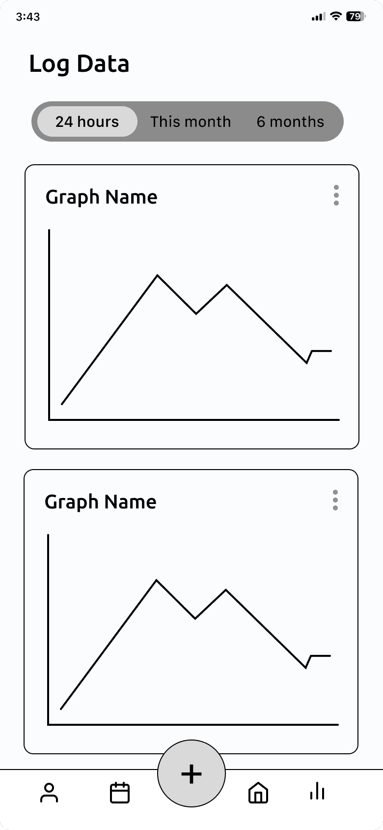
Mobile — Turning logs into insight
While the smartwatch focused on quick input, the mobile experience was designed to help users understand patterns over time.
Decision #4: Separate logging from reflection
Logging happens on the watch; reviewing and interpreting data happens on mobile. Testing confirmed this separation felt natural and reduced cognitive load.
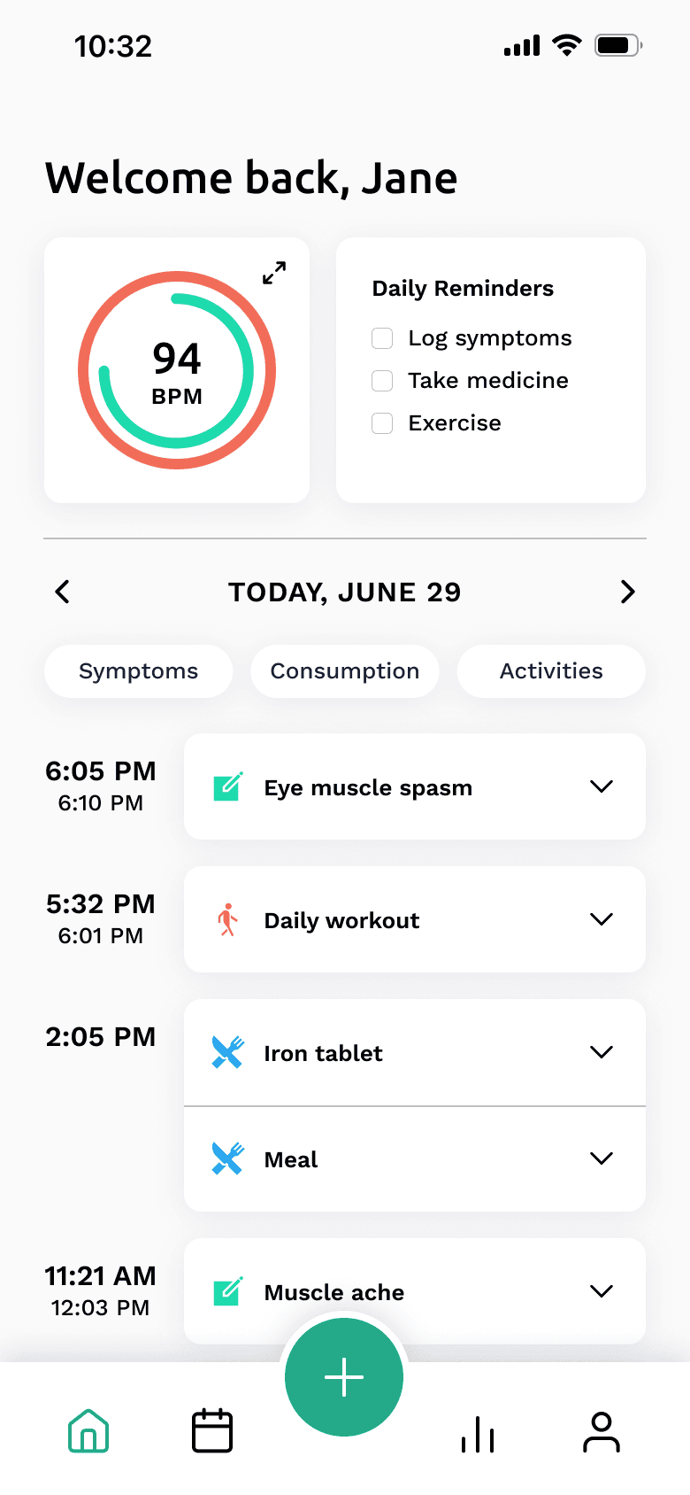
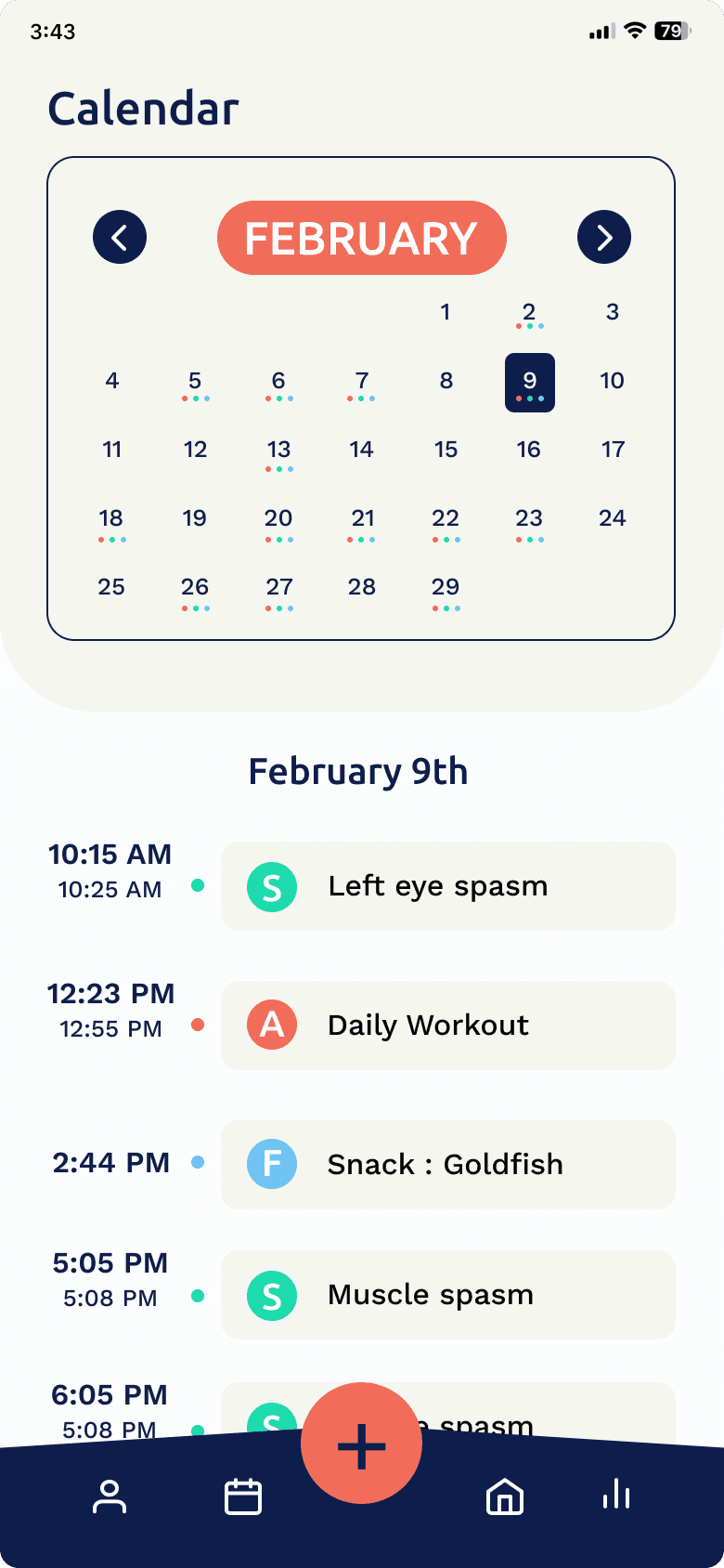
Home
Calendar
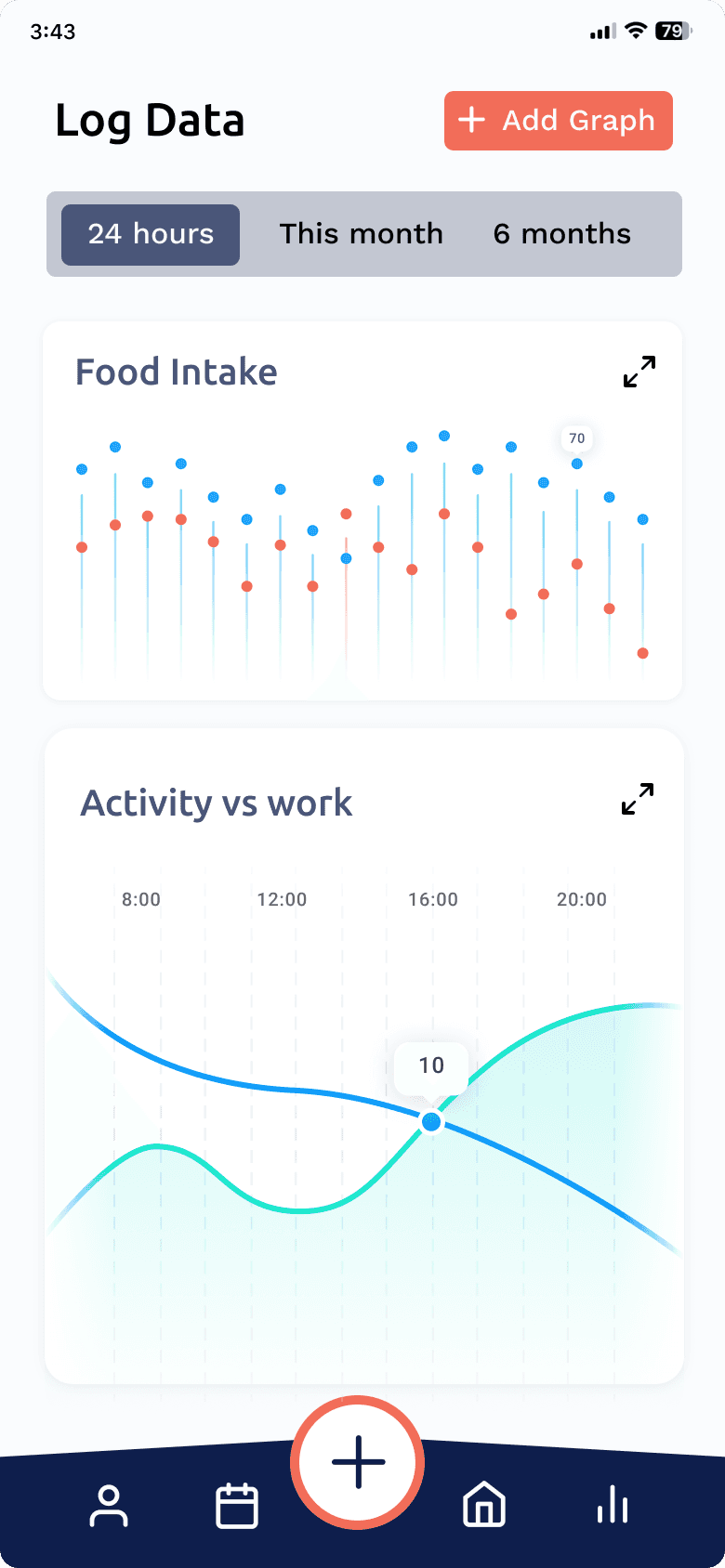
Decision #5: Enable user-configured graphs
Users can choose which attributes to compare, such as activity versus fatigue. This supported deeper reflection without overwhelming users with complex analytics.
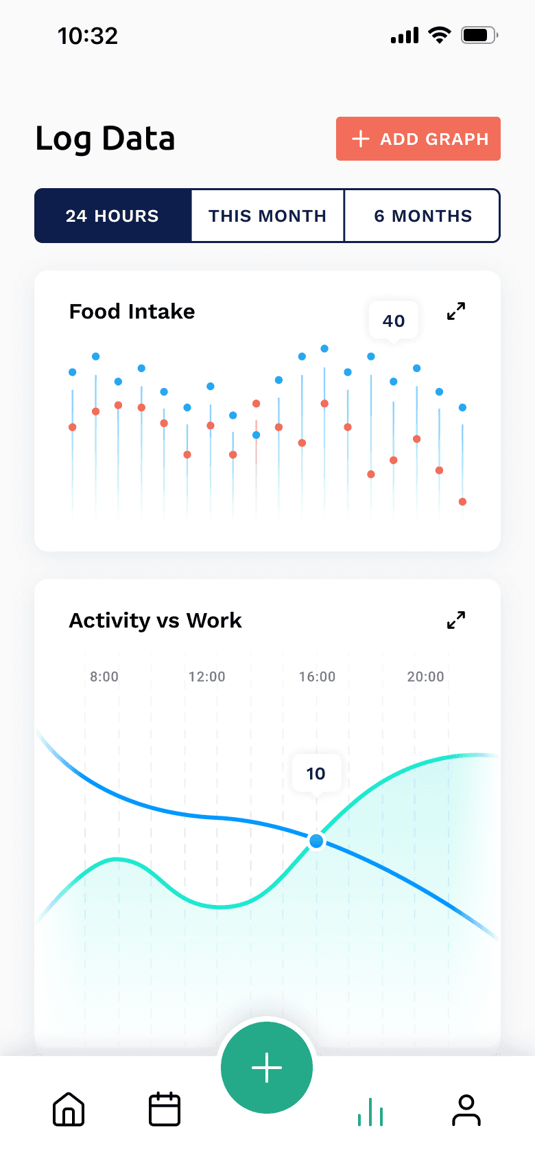
Data
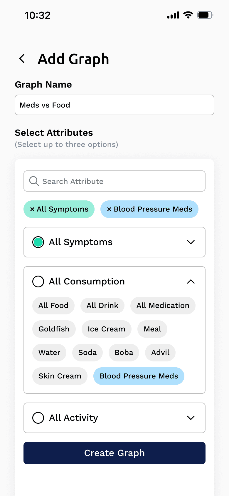
Add Graph
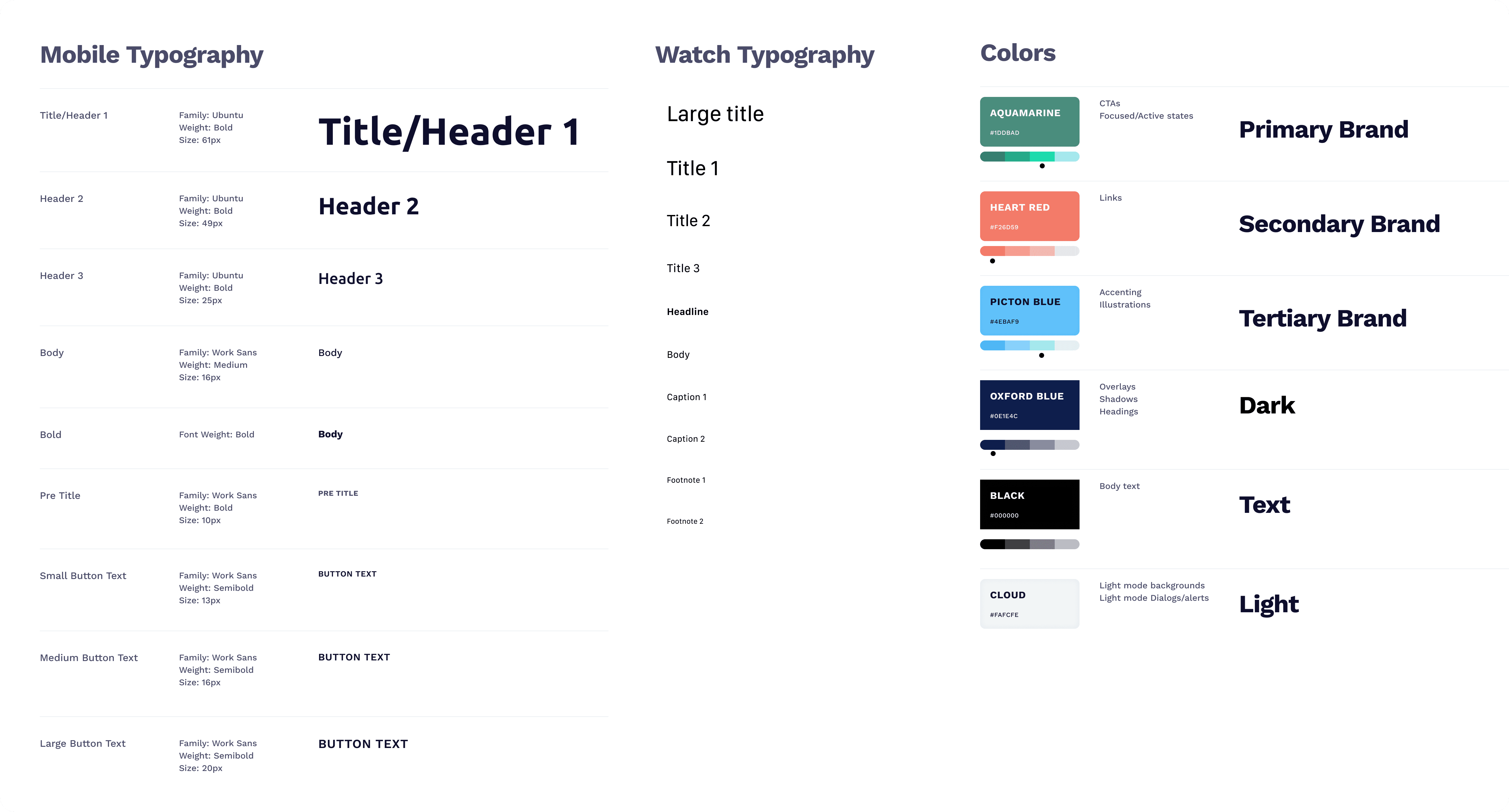
Design System
To ensure consistency across devices, we created a shared design system aligning typography, color, components, and interaction patterns across smartwatch and mobile. This ensured Symplifi felt like one cohesive product, not disconnected experiences.