MedMatch
Designing a mobile experience that helps people clearly understand medication interactions, assess severity, and take the right next steps.
Role
Product Designer
Team
Solo Project
Timeline
Nov 2025 (3 Weeks)
Deliverables
Mobile Prototype
Context
People who take multiple medications often don’t know how their prescriptions interact with each other or with certain foods. When they need answers, they typically turn to Google, medication labels, or medical websites, but these sources are often vague, inconsistent, and not tailored to a person’s full medication list.
For people managing multiple medications, this process becomes tedious and error-prone: users must check interactions pair by pair and mentally combine conclusions. Even when information is found, users are rarely given clear next steps, such as symptoms to watch for, foods to avoid, spacing guidance, or safer alternatives.
MedMatch explores a mobile app concept that helps users quickly understand:
Whether an interaction exists
How severe it is
Why it happens
What to do next
Problem
Medication interaction information is available but not usable when users need clarity most.
Typical issues:
Results are vague, inconsistent, or hard to trust
Users must check medications pair by pair
Severity is unclear and there is no guidance on next steps
No simple way to save or share findings with a healthcare provider
Together, this led to a single core issue:
Core Issue
Users can find interaction information, but they cannot quickly understand risk, severity, or next steps when managing multiple medications. This increases confusion, anxiety, and the risk of misuse.
Research
I conducted two contextual inquiry interviews with individuals who take multiple daily medications to observe how people check interactions in real life. Each participant was given the same task:
“Search how your current medication interacts with a new medication.”
I intentionally selected a medication that would conflict with one of their existing prescriptions to observe real research and decision-making behavior.
From research, several insights were identified:
Interaction checking is too manual
Users must search medications one at a time and combine conclusions themselves.
Severity must be instantly understandable
Users want to know “Is this safe?” before reading details.
Action matters as much as information
Clear next steps reduce anxiety and uncertainty.
Saving and sharing reduces friction
Users want to bring clear interaction info to doctor appointments.
Prioritization
To keep scope realistic while addressing the most impactful problems, I used an impact–effort matrix to prioritize features.
Rather than designing every possible screen upfront, we focused on:
Core smartwatch logging interactions
How mobile could support reflection and pattern-finding
Establishing a calm, approachable visual language
IMPACT AXIS
EFFORT AXIS
YES
MAYBE
MAYBE
NO
Color Coded Severity Labels
Download Interaction Info
Conflict Checks on Med Cards
Scan Med
Check Multiple Meds
Med Tracking
Personalization Beyond Med List
Dose Spacing Automation
Mental Model
Medication interactions are high-stakes and stressful. The product needed to answer one question immediately:
“Is this safe?”
Only after that should it explain why and what to do next.
Rather than designing many disconnected screens, MedMatch follows a single mental model:
Surface risk clearly
Check interactions intentionally
Understand severity and next steps without interpretation
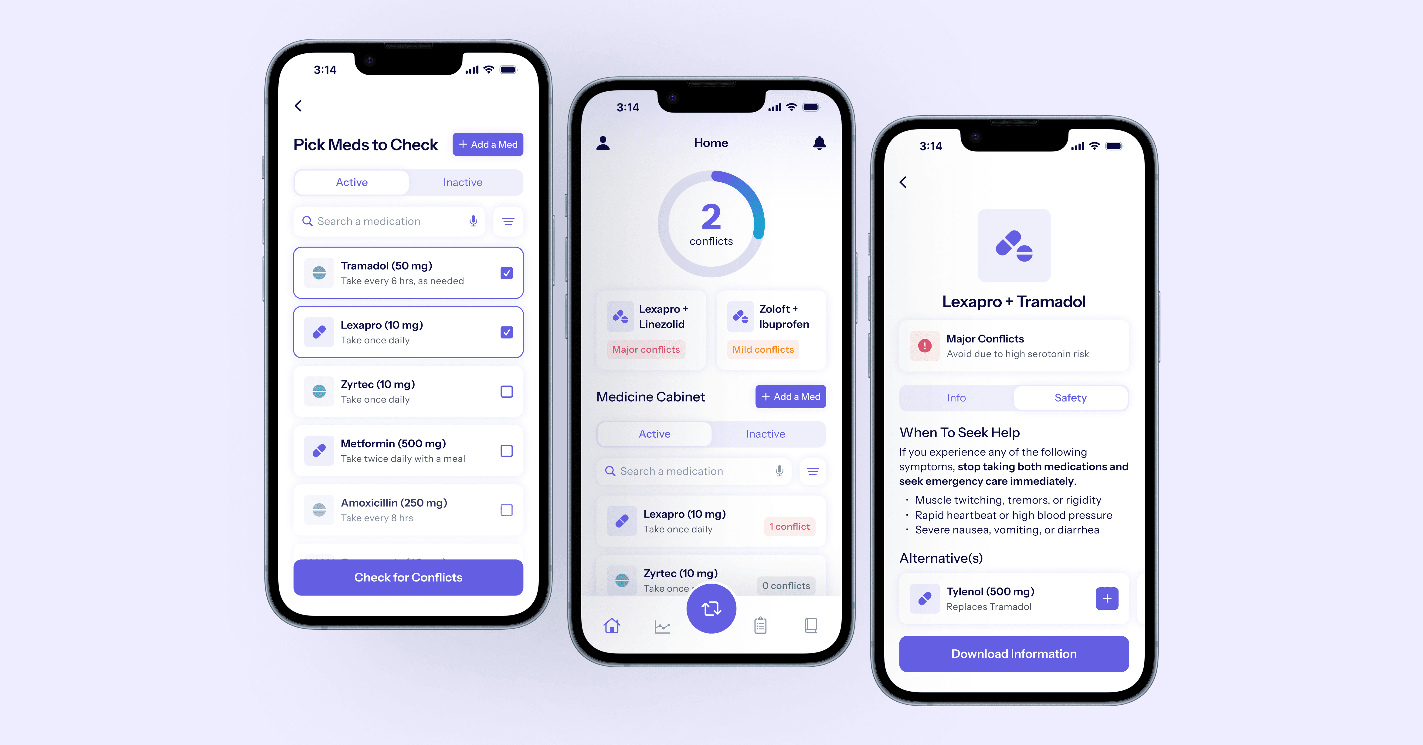
Designs
Home — Immediate awareness with context
The home screen combines two complementary needs:
Immediate awareness of potential interaction risk, and
Clear visibility into the user’s current medications

See overall risk at a glance
Understand which medications interact
Move from awareness to action instantly
The home screen balances passive awareness with immediate action. Users don’t just see that a conflict exists — they see which medications are involved and can check details immediately.
Interaction Check — A focused, low-friction task
Interaction checking is designed as a short, intentional flow that builds directly on the home screen’s mental model.
Rather than introducing a new layout, the flow reuses the medication cabinet pattern to minimize cognitive load and prevent errors.
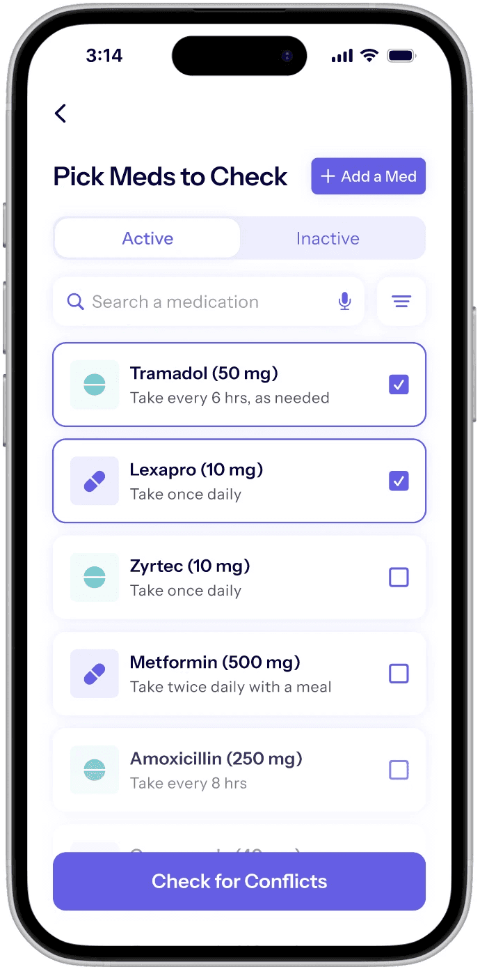
Support safer, informed selection
Add without losing context
Results — Severity first, guidance second
The results screen carries the highest cognitive and emotional load. To reduce overwhelm, it separates understanding the interaction from deciding next steps.

Answer “Is this safe?” immediately
Separate understanding from action
Provide solutions, not just warnings
Make it easy to share with a provider
Outcomes
Because this was a concept project, success was measured by alignment with research needs rather than post-launch metrics.
Compared to current solutions, this design:
Reduced the need to cross-reference multiple sources
Made severity immediately scannable
Provided clear, actionable next steps
Supported sharing information to medical providers